
DESCRIPTION
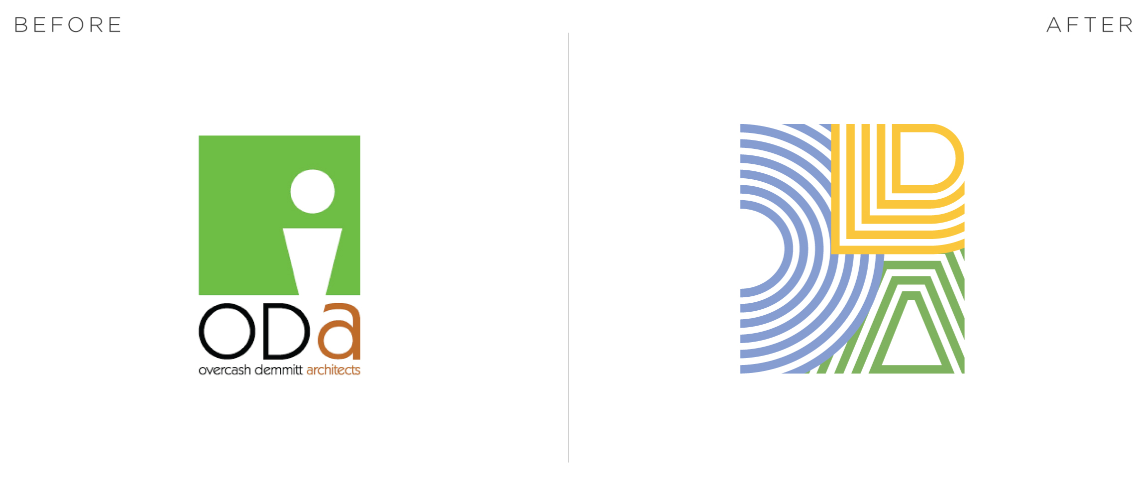
ODA is a Commercial Architecture and Interior Design firm that’s been in business for 35 years. After a partner’s decision to retire, they took this opportunity for a name change and rebrand.
The first step we took in this project was getting to know the client a little better, so we asked the employees of ODA who they are as a brand and what they feel like their core values are. What we got back was unexpected.
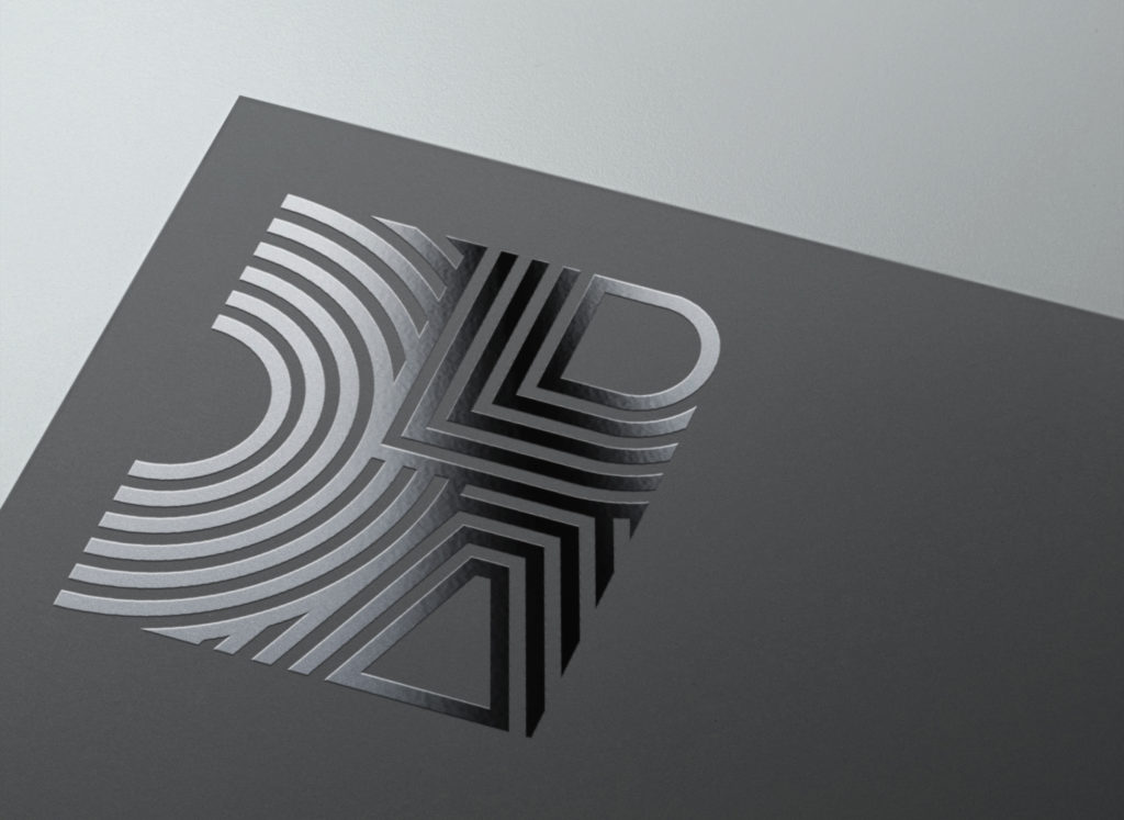
When we started concepting this logo, we kept in mind the principals and personality of ODA Architecture – focused, overachieving and playful. In the end that’s what we ended up with – the precision of each line and the negative space between each line immediately gives the viewer the feeling that this business has an attention for detail. Each letter’s set of layers intersect in a very carefully calculated fashion that gives a feeling of an organized complexity, appropriate for the type of architecture that ODA creates.
The color palette is different than what you would expect of an architect firm. This is a triadic color palette that’s strong and clean but playful at the same time, like ODA.
AD: Savannah Jackson
AE: Rosie Cook
Client: ODA Architecture
BRANDING



STATIONARY

