IDENTITY REBRAND
As America’s Hometown Pizza Buffet, Pizza Inn recognizes its role as the backbone – not just as an organization, but as a cause – of each community it calls home. It’s a position with mileage, and a tinge of nostalgia.
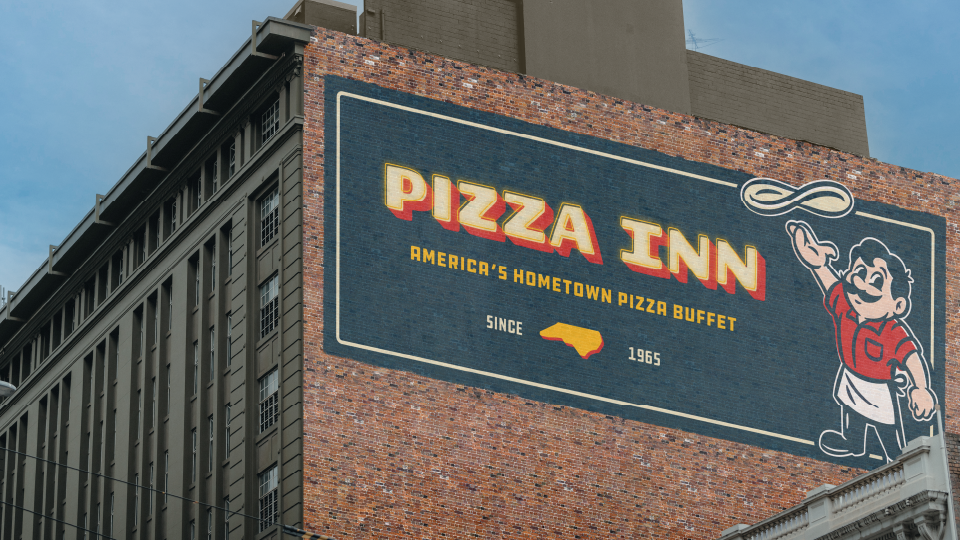
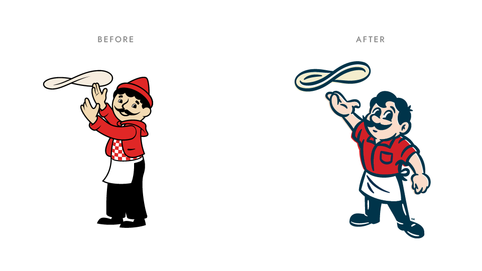
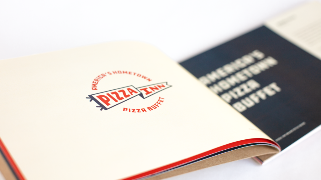
For this project, we are building upon this brand position with an updated logo and refreshed JoJo. Our aim is to balance Pizza Inn’s heritage and nostalgic appeal with a new and reinvigorated brand identity.
Illustrator: Jared Schofner
CD: David Oakley
Strategy: Jake Vowell & Jim Mountjoy
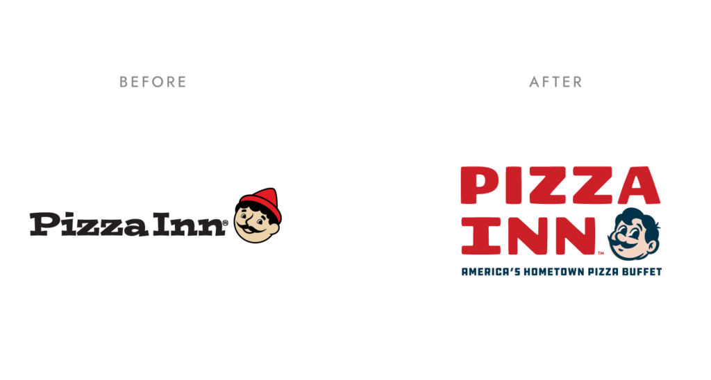
We knew JoJo’s update would be an integral aspect of this rebrand. To ensure its success, we partnered with Jared Schofner, an illustrator who specializes in vintage character design.
Part of JoJo’s redesign involved adding depth as a character. One way we achieved that was by creating multiple poses for adapt to different types of situations.

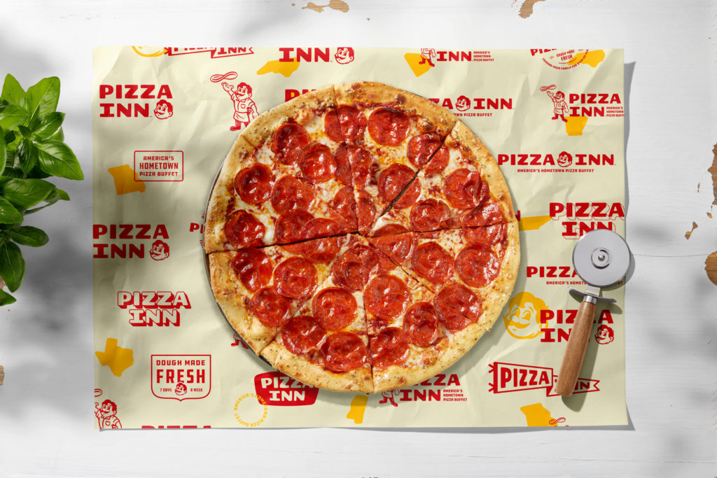
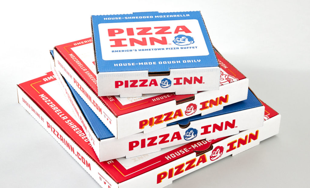
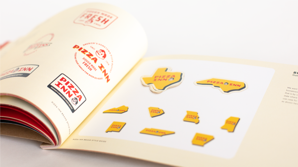
Part of our approach to creating a maintainable brand for so many franchisees to use is adding in a wide variety of secondary elements. Having this kind of variety is something that happens naturally in family restaurants, which is exactly the type of aesthetic we’re going for.




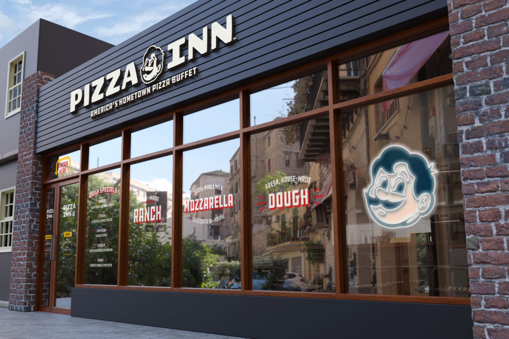
Part of what we’ve created for Pizza Inn is a store signage system for the franchisees to use. The signage system is based off of the “store of the future”, which is still under construction. For now, we are using a mockup to represent what the signage will look like all together.
